
Happy Easter Monday! Wow, hasn’t this weekend been great? Except for Sunday the weather played ball and I feel rejuvenated and relaxed!
I love cherry blossoms and have been happily snapping away while they are blooming. The blogging world has been full of beautiful posts with people finding whole streets adorned with these most precious blossoms. The season generally runs from mid-March to mid-April. In view that I’m late to the party I thought it might be fun to mix things up a little… in the true sense of the word!
I believe that Japanese cherry blossoms are mainly small white flowers. Here in the UK we tend to prefer the pink varieties, with larger pink flowers. I did find some white ones here too and must admit I like both varieties. However, they all tend to look best when in rows and rows of trees all in full bloom!
Colour combinations! Inspiration comes form everywhere, right? Visual platforms like Instagram and Pinterest have taken over and if you’re looking for colour inspiration, theses would be one’s first port of call. Personally, I can get quite overwhelmed and sometimes I like to create my own colour combinations for various projects or paintings I might be working on. Doing it myself makes me look harder, learn about what works (for me) and what doesn’t and question why!?
I like to use my own photography to experiment as this enables me to also find inspiration for pattern making, another passion of mine!
So, instead of only showing you photos I took of cherry blossoms and other flowering trees, here are some colour combinations for you. I hope there is something for everyone.
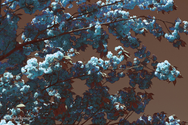
This first combination (shade of teal, shades of saffron and dark brown) has the right balance for me. The blossoms pop against the teal but no colour is fighting for too much attention. A calming and sophisticated look!

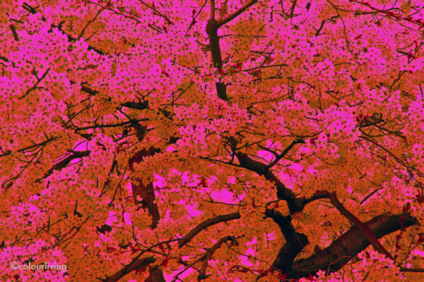
The next 2 photographs are the same. Here I demonstrate how popping colours create an overall pattern, only to be held together by the dark tree branches and trunk. If you substitute one colour with here a calm dark green, this shifts the focus of foreground and background to reveal a different and maybe less abstract end result.

In this next photograph I use the clouds to create the light green shapes. Again, the green and the grey backgrounds still allow the blossom to show off its delicate flowers and intricate pattern. A calming effect.

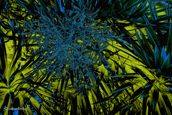
I’m generally not a huge fan of this colour combination. Here you have 2 strong and dominant colours that can easily fight each other for attention. Shade of lime green and cobalt blue are usually far too primal for me. However, I think it works here because of the strong pattern formation and the main flowers being predominantly in a far softer shade of the blue. It’s less zesty and shows how different shades of the same colour can have a tremendous effect on the overall look and feel!
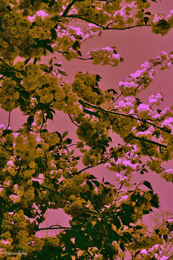
A favourite combination of mine. This kind of graphics and colour always makes me think of Japan, Kimonos and printed textiles. I love the shade of antique rose against the dark branches and leaves. The subtle shade of lime and zingy pink compliment each other very well.
Another take on the cherry blossom. Darker, moodier but with little pop of light blue. I must confess I have always loved this combination in clothes. The right shade of brown with the right shade of blue is often unbeatable !

Here you have it. A few colour combinations for you. I’d love to know what combination(s) speak to you and maybe you would like to share some of your favourites. Happy week, see you Thursday where I’ll be joining the #urbanjunglebloggers for the April edition!


14 Comments
Oh so cool Tina! I agree, I always like brown and blue together. I have to say that my favourites are definitely the ones with the hues of pinks and reds in it. Glad you had a lovely Easter, wish I could say that the weather was good over here – it didn’t stop raining! M xx
Ha. Thank you Mel!
It has to be the right brown and blue shades.. that’s the tricky part. I once saw a guy in Milan wear Jeans, a light blue shirt (the right shade), a brown cashmere sweater (the perfect shade) and brown loafers. OK, it helped he was gorgeous but that combo was really priceless!
I do like the ones with pinks and reds too.
The weather here was mostly great. Now it’s turning. x
I’m with Mel, the brown and blue is my fav. Lovely shots Tina xx
Thank you Debra x
Very cool Tina! Have to say that I love the first image, that golden yellow & teal (with hints of grey in there too). Quite beautiful! And I also love the Japanese-esque antique rose against the dark branches & leaves.
Gx
I think those 2 are also my favourites. I wonder whether it’s because they are cherry blossoms as well as the colour combination?
Thank you Gerard. It makes me want to get out my paints and re-produce them. x
Hello gorgeous!
The first image with teal, saffron and brown is definitely my fave. So happy the weather was wonderful. I am still waiting for autumn to kick in here.
Hope you are having a lovely week xx
Hello sweetherat. Nice to see you here:-)
Thank you:-) Hope Autumn will kick in soon.. Love to Miss S xx
Beautiful, Tina.
I was going to say I like the first one best, until I saw the next one, then the next one, then the next one…
They are all so intense and rich, and have something of a vintage feel.
Thank you Alison.
Hahaha. Glad you liked them. Yes, some have a real vintage feel. would be fun to have them printed as fabric. Will investigate:-) x
This is so cool. You always come up with the most original idea! My favourite is the teal and yellow. xD
Ha. Thank you Doris (blush)… I’d say your take on the UrbanBlogger this month was pretty original:-))
Yes, I do love the teal and yellow x
totally love this post! I especially like how you demonstrated the effects different colour choices have on the same image. Colour Experiments with Colourliving! It’s like you let us in to your colour-brain through your colour-eyes. It feels really special 🙂
Great colour schemes and patterns. My favourite is the first.
xoxo
Aww, thank you sweety. Yes, was going to show more of the same image, different effects bbut didn’t want to overload!
Ha. That’s sweet. I love colour and it comes natural to me.
I very much like the first one and it was hard to follow suit:-)) x